About VIVO's Map of Science Visualization
Reference Basemap
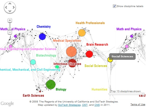
The VIVO Map of Science visualization uses the UCSD map of science and classification system that was computed using paper-level data from about 25,000 journals from Elsevier's Scopus and and Thomson Reuters' Web of Science (WoS) for the years 2001-2010. The UCSD map of science assigns the 25,000 journals to 554 subdisciplines that are further aggregated into 13 main disciplines of science. In the map, each discipline has a distinct color (green for 'Biology', brown for 'Earth Sciences', etc.) and a label. (Sub)disciplines that are similar closer to one another on the map. (Sub)disciplines that are especially similar are connected by grey lines.
Data Overlay
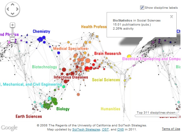
Publication activity of a university, organization, or person can be overlaid on the map to generate expertise profiles. The process is as follows: (1) The set of unique journals is identified, (2) the number of times each journal served as a publication venue is calculated, and (3) the area size of the 13 disciplines and 554 subdisciplines is calculated based on these journal publication venue counts. Note that some journals are associated with exactly one (sub)discipline while others, e.g., interdisciplinary ones like Science or Nature, are fractionally associated with multiple (sub)disciplines. Subdisciplines inherit the colors of their parent disciplines. (Sub)disciplines without any associated publications are given in gray.
Expertise Profile Comparison Map
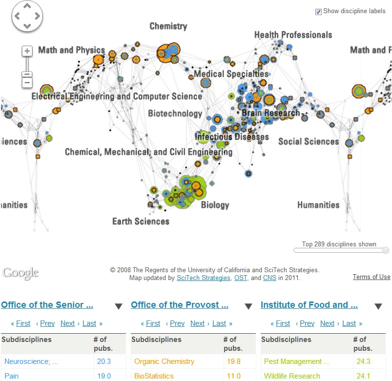
Publication activity of up to three organizations or persons can be compared via "Compare organizations." In the table on the left, select up to three organizations. The expertise profile of each organizations will be represented as data overlay. Each organizations is represented in a distinct color and a top-10 list of subdisciplines with the highest number of publications is given below the comparison map. Data can be saved as CSV file.
Interactivity
The map can be explored at two levels-by 13 disciplines or 554 subdisciplines. Clicking on a node in the map brings up the number of fractionally associated journal publications and the percentage of publications mapped to this (sub)discipline. Hover over a discipline in the table on the left to see what circles it corresponds to on the map. Use slider below map, on the right to reduce number of subdisciplines shown to improve legibility
Links
For more information on the UCSD map of science and classification system, see http://sci.cns.iu.edu/ucsdmap. For other maps of science, see http://scimaps.org and http://mapofscience.com.